Milkwood House
Boutique guesthouse — Wilderness, Western Cape
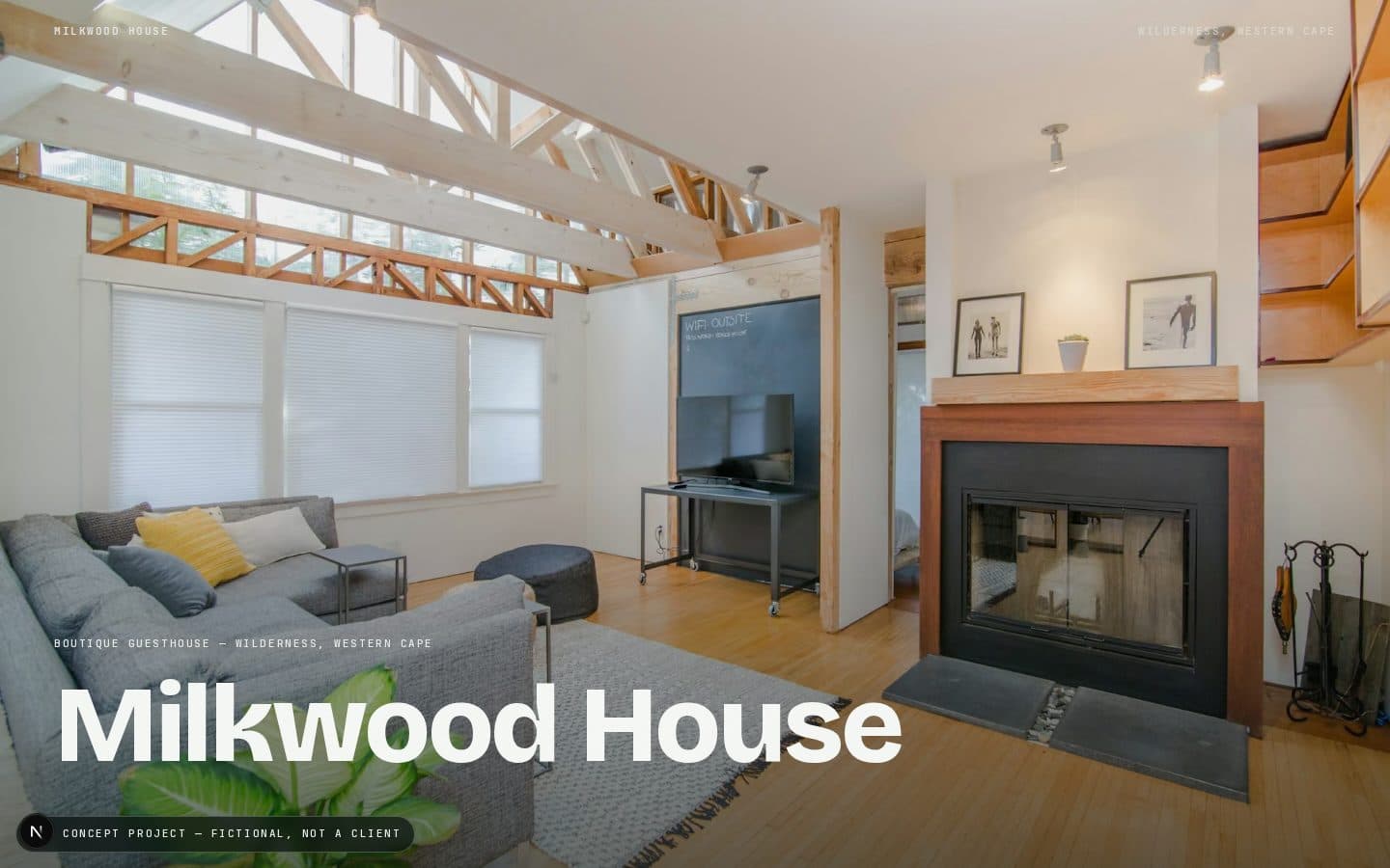
Hospitality. A five-room guesthouse competing for attention against big booking platforms and generic templated hospitality sites.
Most small guesthouse sites either copy a big-hotel template that doesn't fit five rooms, or overcompensate with busy galleries and pop-up booking widgets. The brief MMS set itself: prove that restraint reads as premium — let five rooms and a real setting carry the whole site, without a single stock hospitality cliché (no infinity pools, no couples-holding-wine-glasses stock photography).
The most restrained of the three concept projects, deliberately. Maximum negative space, the largest imagery of any concept, and the slowest pacing — full section padding, one idea per screen. This is also the project the homepage's proof device scroll-scrubs, so every section had to read as premium even shrunk into a small browser frame, which pushed toward simpler, bolder compositions rather than intricate ones.
Same three-face system as the rest of the site — Bricolage Grotesque, Switzer, JetBrains Mono — but used more quietly here than anywhere else on MMS Web. Headlines stay large but sentence-length; mono is reserved almost entirely for rates and room metadata, not decoration.
Full-bleed photography carries each section. Room presentation alternates image-left/image-right down the page, mirroring the pattern used in the homepage's Selected Work section but slowed down — each room gets its own full scroll beat rather than being compressed into a grid.
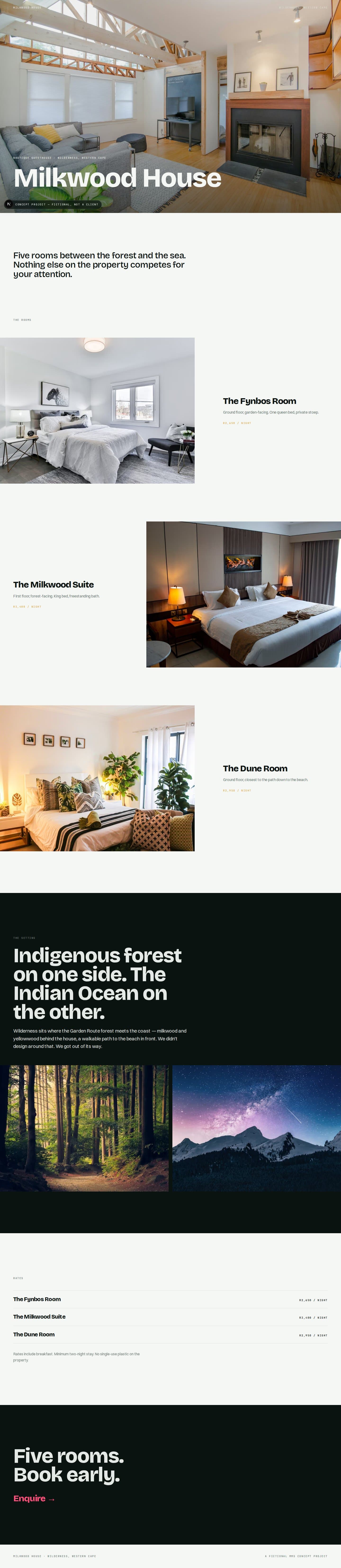
Sections stack vertically without cropping the sense of space — images stay large and full-width rather than shrinking into thumbnails. Rates collapse into a plain stacked list; nothing about the restraint is sacrificed for the smaller viewport.

Deliberately minimal. Reveal-on-scroll only, matching the rest of the site's motion language (once-only, 15% viewport entry). No parallax, no hover galleries, no booking-widget gimmicks — the brief was restraint, and that had to hold in the motion design too, not just the layout.
Built as a real Next.js route (/concepts/01), not a mockup — same design-token system as MMS's own site (src/app/globals.css), real photography sourced from Unsplash and logged in HANDOVER.md. This page was screenshotted and scroll-recorded with Playwright (scripts/generate-work-assets.mjs) to produce the preview video and poster used in the homepage's Selected Work section, and it's the exact page the homepage hero's proof device scrubs live via an iframe.